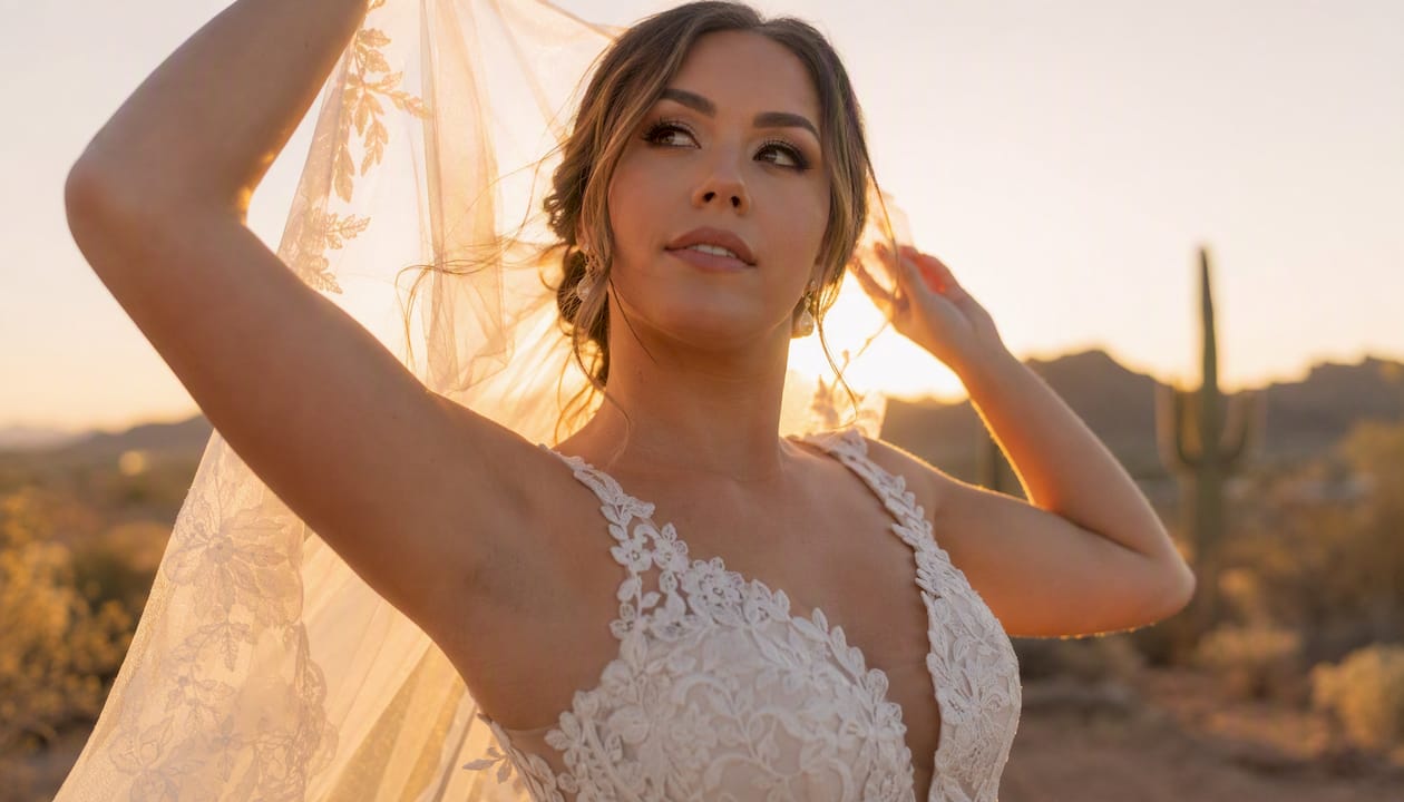


What Photo Composition Means for Portraits
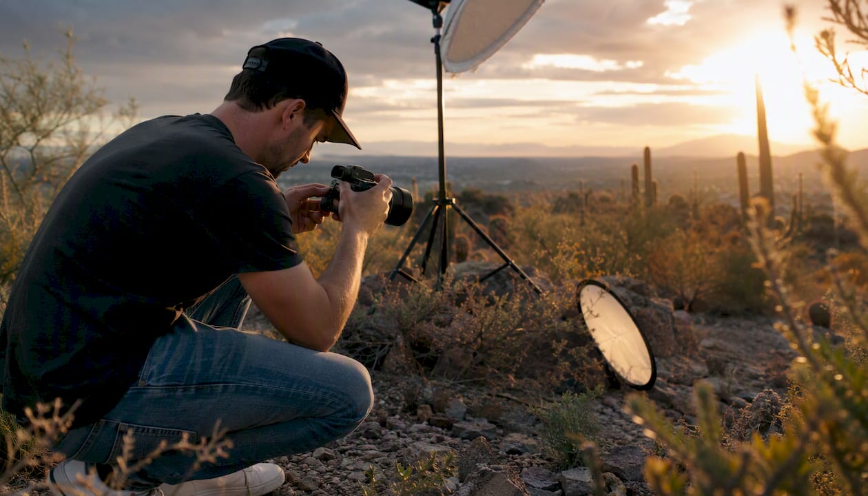
Portrait composition is the deliberate arrangement of subject, foreground, and background within the frame to direct the viewer’s eye straight to the face and eyes. Every decision you make — where you place the subject, what sits behind them, how much empty space you leave — either supports that goal or fights against it. Three things you can do right now:
- Place your subject’s eyes on the upper horizontal third of the frame, not dead center.
- Leave breathing room in the direction your subject is looking so the frame doesn’t feel closed off.
- Step back and scan the background for distracting elements before you press the shutter.
Composition is also a storytelling tool. The same person, photographed with a tight crop against a clean wall versus a wide shot in their workshop, tells two completely different stories about who they are.
Key Takeaways
Strong portrait composition starts with a single question: does every element in the frame direct the viewer’s eye to the subject’s face and eyes, or does something compete with it?
| Point | Details |
|---|---|
| Eyes on the upper third | Place the subject’s eyes on the upper horizontal third of the frame for immediate visual energy. |
| Headroom and breathing room | Leave a small gap above the head and open space in the direction of the subject’s gaze. |
| 85–135mm focal length | Medium-telephoto lenses compress features and simplify backgrounds for flattering portraits. |
| Combine composition tools | Use leading lines, framing, and negative space together rather than relying on one rule alone. |
| Master shot first, then experiment | Get a clean, safe composition before breaking rules to create editorial or emotional impact. |
Table of Contents
- Why does composition matter so much in portrait photography?
- Core composition rules and how to apply each to portraits
- How do lenses and focal length affect portrait composition?
- How does background depth strengthen your portrait composition?
- How posing and subject placement work as compositional tools
- How light direction and catchlights shape your portrait composition
- When should you intentionally break composition rules in portraits?
- Step-by-step checklist for composing a portrait in the field
- Common portrait composition mistakes and how to fix them fast
- Three portrait setups you can shoot today
- How cultural and contextual elements add storytelling depth to portraits
- How color theory and color harmony improve portrait composition
- Background blur levels relative to subject distance
- Strategies for composing environmental portraits that balance subject with surroundings
- An editorial perspective on portrait composition
- Sources
Why does composition matter so much in portrait photography?
Most viewers spend the first fraction of a second scanning a portrait for the eyes. If your composition doesn’t guide them there quickly, the image feels off, even if they can’t explain why.
Consider a simple example: the same pose, cropped two ways. A three-quarter shot with the subject centered and equal space on all sides reads as flat and passport-like. Shift the subject to one side, leave open space in the direction of their gaze, and suddenly the image has tension, mood, and direction. Nothing changed except the framing.
Composition conveys story and emotion through decisions about background inclusion, negative space, and camera angle. A low angle can make a subject look powerful. A high angle can create vulnerability. A tight crop on the eyes alone can feel confrontational or intimate. These aren’t accidents — they’re choices.
The face and eyes are the primary focal points in any portrait. Every compositional element either supports that focus or competes with it. A bright red object in the background, a harsh line cutting through the subject’s head, or a distracting pattern on a wall all pull the viewer’s attention away from where you want it. Understanding the difference between a headshot and a portrait also shapes how aggressively you apply these principles.
Core composition rules and how to apply each to portraits
These tools work best when you combine two or three of them rather than relying on any single rule. Here’s how each one applies specifically to portrait work.
Rule of thirds and rule of space
Divide your frame into a 3x3 grid. Place your subject’s eyes on one of the two upper intersection points. This single adjustment creates more visual energy than centering the face. The “rule of space” extends this: when your subject looks to one side, leave more empty space on that side. Cutting off the space in front of the gaze makes the frame feel cramped.
The Rule of Thirds and rule of space are reliable starting positions for eye placement and directional negative space in portraits. They’re not laws, but they’re the safest default when you’re still building your eye.
Leading lines
Lines in your scene — a fence, a staircase railing, a row of trees — can guide the viewer’s eye toward your subject. The key requirement: the line must terminate at or near the face. A leading line that runs past the subject and off the frame becomes visual clutter that competes with your subject rather than supporting them.
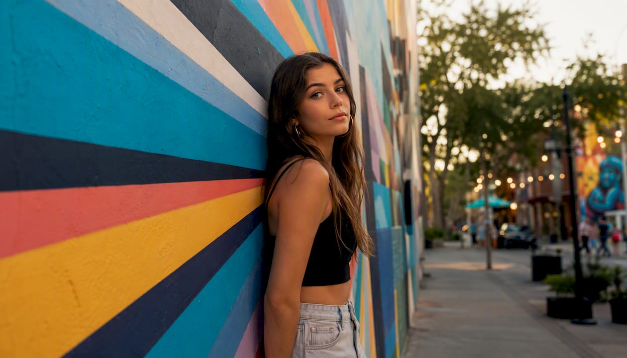
Framing within a frame
Doorways, windows, archways, and even a subject’s own arms can create a secondary frame around the face. This technique layers depth into the image and naturally concentrates attention on the person inside the frame. It works especially well in environmental portraits where you want to show context without losing the subject.
Negative space vs. fill the frame
These two approaches create opposite emotional effects. Negative space — leaving large areas of sky, wall, or ground around the subject — suggests isolation, contemplation, or scale. Filling the frame with the subject’s face creates intensity, intimacy, and presence. Neither is wrong; the choice depends on the story you’re telling.
Symmetry vs. asymmetry
Centered, symmetrical compositions work well for subjects who project authority or calm — think formal headshots or portraits where the subject faces directly into the lens. Asymmetrical placement creates dynamism and feels more candid. Most portraits benefit from asymmetry, but don’t dismiss symmetry as a creative choice when the subject and mood call for it.
| Composition Tool | Best Portrait Use | Emotional Effect |
|---|---|---|
| Rule of Thirds | Eye placement, gaze direction | Energy, natural movement |
| Leading Lines | Outdoor, architectural settings | Direction, depth |
| Framing Within Frame | Doorways, windows, arms | Depth, context, intimacy |
| Negative Space | Minimalist, contemplative shots | Isolation, calm, scale |
| Fill the Frame | Tight headshots, editorial | Intensity, presence |
| Symmetry | Formal headshots, authority shots | Power, stability |
| Asymmetry | Candid, lifestyle, editorial | Dynamism, naturalness |
Pro Tip: Once you’ve nailed a clean, balanced composition, try breaking one rule deliberately. Center the subject for a symmetrical shot, or crop unusually tight on the eyes. Intentional rule-breaking creates editorial impact — but only after you’ve established the safe version first.
How do lenses and focal length affect portrait composition?
Focal length doesn’t just change how much of the scene you capture. It changes the relationship between your subject and the background, and it changes how facial features are rendered.
Medium-telephoto focal lengths — roughly 85–135mm on a full-frame camera — compress features slightly and push the background further out of focus. This is why they’re the practical default for flattering portrait work. The compression makes facial proportions look natural, and the background simplification reduces compositional clutter without requiring a perfectly clean location.
Wide-angle lenses (24–35mm) used close to the subject distort facial features, making the nose appear larger and the ears smaller. This distortion can work for creative editorial portraits, but it’s a poor choice for flattering headshots. If you want environmental context with a wide lens, step back and let the scene breathe around the subject rather than filling the frame with a close-up face.
A 50mm lens on an APS-C body behaves like a 75–80mm full-frame lens, which puts it in a useful portrait range. A 35mm on crop sensor gives you roughly 50–56mm equivalent, which works well for environmental portraits but can still distort slightly at close distances.
The practical takeaway: step back and zoom in rather than moving physically close with a wide lens. You’ll get cleaner facial proportions and a more compressed, flattering background.
How does background depth strengthen your portrait composition?
Depth separates your subject from the scene. Without it, a portrait can look flat, like a cutout pasted onto a background. With it, the image has dimension and the subject reads as three-dimensional.
Layering works on three levels:
- Foreground: An out-of-focus element in front of the subject (a flower, a fence post, a piece of foliage) adds depth and frames the scene without competing with the face.
- Middle ground: Your subject lives here. Keep this zone clean and uncluttered.
- Background: The further the background sits from your subject, the more blur you can achieve at a given aperture.
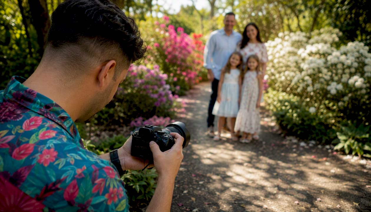
Using foreground elements out of focus with a longer focal length creates depth while keeping the subject dominant. A wider aperture (f/1.8 to f/2.8) helps the frame read as layered rather than cluttered.
For busy backgrounds, your two fastest fixes are aperture and distance. Open up to f/1.8 or f/2.0 and move your subject further from the background. A subject standing 3 feet from a brick wall will show every brick in sharp detail even at f/2.8. Move them 10–15 feet away from the same wall and the bricks dissolve into a soft texture.
Pro Tip: Match your background contrast to your subject’s clothing and skin tone. A light-skinned subject in a white shirt against a white wall disappears. A dark jacket against a dark background does the same. You want separation — either in tone, color, or both. Check out how to choose a background for business headshots for a deeper breakdown of this principle.
How posing and subject placement work as compositional tools
Posing isn’t just about making someone look comfortable. Every body position is a compositional decision that affects lines, shapes, and where the viewer’s eye travels.
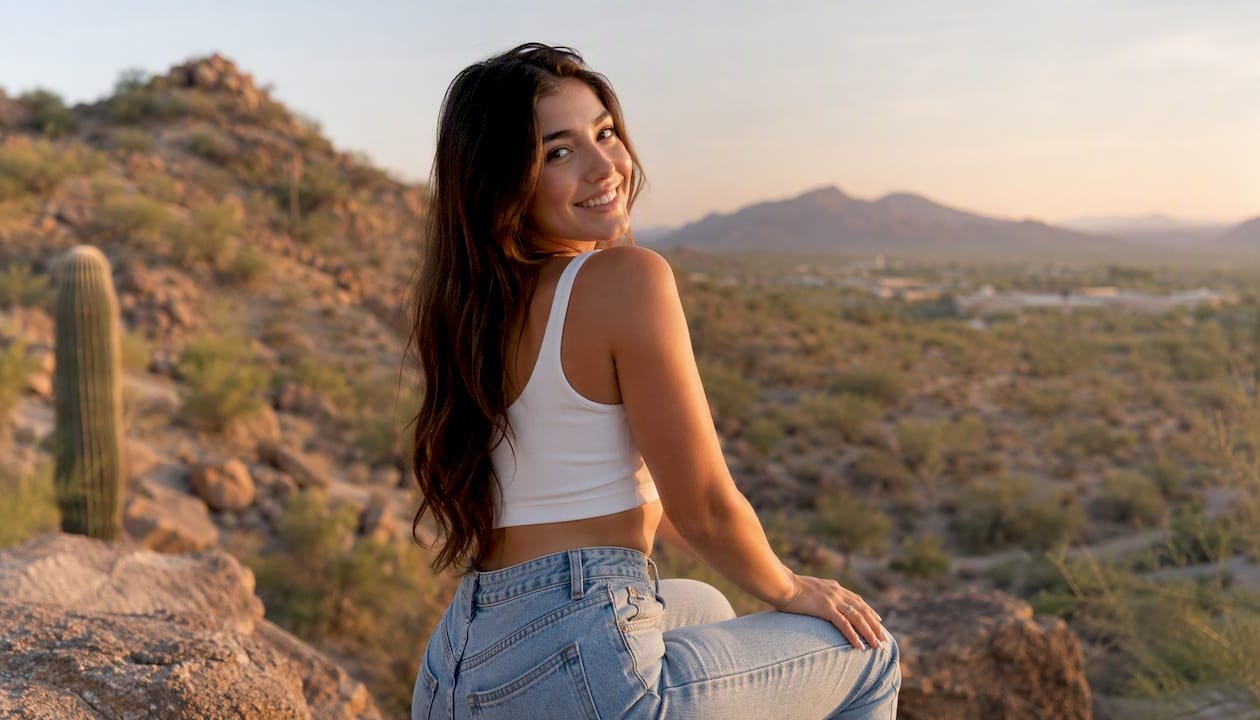
The most reliable flattering pose: angle the body 30–45° away from the camera, then rotate the face back toward the lens. This slims the torso by showing it at an angle rather than full-width, while keeping the face fully visible. Square-on poses work for authority shots but can make most subjects look wider than they are.
Avoid cropping at joints — wrists, knees, and ankles. Cropping at a joint creates a visual “amputation” effect that reads as careless. Safe crop zones are mid-forearm, mid-thigh, and mid-calf. These cuts feel natural because they don’t interrupt the body at a point of articulation.
Hands need specific attention. When a hand pushes toward the lens, perspective distortion makes it appear disproportionately large. Keep hands in roughly the same focal plane as the torso — resting on a hip, tucked lightly under the chin, or held at the side. If you’re shooting a professional executive portrait session, hand placement often signals confidence or approachability, so it carries compositional and narrative weight simultaneously.
Headroom and breathing room are the two most commonly mishandled spacing issues. Headroom is the space between the top of the subject’s head and the top of the frame. Too little feels claustrophobic; too much makes the subject look small. Breathing room is the space in front of the subject’s gaze. When a subject looks left, leave more space on the left side of the frame.
Pro Tip: For clothing choices that affect how posing and composition read on camera, direct your subjects to dress for professional headshots before the session. The right clothing simplifies your compositional job considerably.
How light direction and catchlights shape your portrait composition
Lighting and composition are inseparable in portraits. Where light comes from determines where shadows fall, and shadows determine how the viewer reads the three-dimensional shape of the face.
Here’s a quick breakdown of how light direction affects both mood and compositional dominance:
- Front lighting (light source directly in front of the subject) flattens facial features and minimizes shadows. It’s clean and even, but can reduce the sense of depth in the face. Works well for beauty and commercial portraits where smooth skin is the priority.
- Side lighting (Rembrandt or split) creates strong shadows on one side of the face, adding drama and sculpting the bone structure. The shadow side recedes visually, which draws the eye to the lit side. Compositionally, this creates a natural focal path.
- Backlight separates the subject from the background with a rim of light around the hair and shoulders. It adds depth to the composition and works beautifully for outdoor portraits in golden hour light. You’ll need a fill source (reflector or flash) to keep the face exposed correctly.
Catchlights — the small reflections of the light source visible in the subject’s eyes — are critical. Eyes without catchlights look flat and lifeless. The viewer’s attention skips over them. Before you shoot, check these four things:
- Are catchlights visible in both eyes? Reposition the light source or the subject until they appear.
- Is the shadow side of the face balanced — dark enough for depth, but not so dark the eye socket disappears?
- Are highlights on the forehead or cheeks clipping to pure white? If so, reduce light intensity or reposition.
- Does the light direction support your compositional intent? Side light for drama, front light for clean commercial work, backlight for separation and warmth.
When should you intentionally break composition rules in portraits?
Rules give you a reliable foundation. Breaking them intentionally gives you editorial impact. The distinction is that word: intentionally. A broken rule that looks like a mistake is just a mistake.
Centered symmetry is the most useful rule to break deliberately. Placing the subject dead center with equal space on all sides violates the Rule of Thirds but creates a sense of authority, confrontation, or stillness that off-center placement can’t replicate. Fashion and editorial photographers use this constantly for a reason.
Tight, unconventional crops — cutting off the top of the head, cropping at the chin, filling the entire frame with eyes — create drama and force the viewer into an intimate relationship with the subject. These crops work in editorial contexts where the goal is impact over flattery.
Compositional rules are primarily guidelines. Once you can reliably produce a clean, balanced frame, you can break rules to create more editorial or emotional images. The safe workflow: shoot your master shot first — clean composition, proper headroom, eyes on the third — then experiment. Change the crop, shift to center, try an extreme close-up. You’ll always have the safe version, and you might come away with something stronger.
Step-by-step checklist for composing a portrait in the field
Use this sequence on every shoot, regardless of the portrait type. It takes about 30 seconds once it becomes habit.
- Set your focal length first. Choose 85–135mm full-frame equivalent for headshots and three-quarter shots. Wider for environmental portraits, but step back to avoid distortion.
- Check the background. Scan for bright spots, distracting lines, and objects growing out of the subject’s head. Reposition the subject or change your angle before you do anything else.
- Place the eyes. Activate your grid overlay and position the eyes on the upper third. Adjust for headroom — a small gap above the head, not a large empty sky.
- Set breathing room. Leave space in the direction of the gaze. If the subject looks right, the right side of the frame should have more room.
- Check catchlights. Look at the eyes in your viewfinder or live view. If you don’t see a catchlight, reposition the light or the subject.
- Confirm the pose. Body at 30–45°, face back toward the lens, hands in the torso’s focal plane, no joints at crop edges.
- Shoot the master shot. Get a clean, properly composed frame.
- Experiment. Try a tighter crop, shift to center, change your angle by 15°, or open up the aperture.
Quick notes by portrait type:
- Headshot: Crop at mid-chest or just below the shoulders. Eyes on upper third. Minimal background.
- Three-quarter: Crop at mid-thigh. Body angle visible. Background can include more context.
- Full-length: Crop just below the feet or at mid-calf. Use leading lines to draw the eye up to the face.
- Environmental: Subject occupies roughly one-third of the frame. Location tells the other two-thirds of the story.
Pro Tip: If you’re stuck on a location with a messy background, change your shooting angle before you change your location. Shooting from lower and angling up often puts sky or a clean wall behind the subject instead of a cluttered street.
Common portrait composition mistakes and how to fix them fast
Most composition errors in portraits fall into a short list of repeatable mistakes. Recognizing them quickly during a shoot is the skill that separates good photographers from great ones.
Cropping at joints. You frame a three-quarter shot and the bottom of the frame cuts right at the wrist or knee. Fix: move the crop up to mid-forearm or down to mid-thigh. One reframe, done.
Insufficient headroom. The subject’s head nearly touches the top of the frame, or there’s so much sky above them that the face looks small. Fix: adjust your zoom or step closer, then reframe with the eyes on the upper third.
Busy background. A telephone pole appears to grow from the subject’s head. A bright window creates a hot spot that pulls the eye. Fix: move the subject two steps left or right, or change your shooting angle by 10–15°. Alternatively, open your aperture to blur the background further.
Eyes off the third. The subject’s eyes sit in the middle of the frame, creating a static, flat composition. Fix: reframe so the eyes sit on the upper horizontal third. This single adjustment adds visual energy to almost every portrait.
No breathing room. The subject looks toward the edge of the frame with no space in front of them. Fix: reframe to leave more space in the direction of the gaze, or flip the subject’s orientation.
For fixes in post: cropping in Lightroom or Capture One can correct headroom and breathing room issues, but you can’t recover a busy background or a joint crop after the fact. Get these right in camera. The one post-fix that genuinely works is background blur simulation through masking tools in Lightroom, though it rarely matches what a wide aperture achieves optically.
Practice drill: Set up a single subject and shoot 10 frames, deliberately making one mistake per frame, then correcting it. Naming the mistake before you fix it builds the muscle memory to catch it in real time.
Three portrait setups you can shoot today
These three recipes give you a complete starting point: scene, composition approach, and suggested camera settings.
-
Tight headshot. Find a clean, neutral wall or use a seamless backdrop. Position your subject 6–8 feet from the background. Shoot at 85–105mm (full-frame equivalent), f/1.8–f/2.8, and crop just below the collarbone. Place the eyes on the upper third. The background should render as a soft, even tone with no distracting detail. Vary by shifting the subject slightly off-center for a more editorial feel, or move to center for a formal look.
-
Environmental portrait. Choose a location that tells something true about the subject — their studio, a market, a workshop. Use a 35–50mm equivalent lens and position the subject in the left or right third of the frame. Let the environment fill the remaining two-thirds. Shoot at f/4–f/5.6 to keep enough of the scene in focus to read clearly. A leading line from the environment (a workbench edge, a row of shelves) pointing toward the subject adds compositional structure. Vary by moving closer and opening the aperture to blur the background more, shifting the balance toward the subject.
-
Creative editorial. Pick one rule to break. Try a centered, symmetrical tight crop at the eyes with the top of the head cut off. Shoot at 85mm or longer, f/2.0–f/2.8, and fill the frame with the face. The unconventional crop creates immediate visual tension. Vary by experimenting with a slight upward or downward angle to shift the power dynamic between viewer and subject.
For all three setups, shoot your master version first, then vary. Visual storytelling through composition gets stronger when you make deliberate choices about what to include and what to leave out.
How cultural and contextual elements add storytelling depth to portraits
A portrait doesn’t exist in a vacuum. The objects, clothing, setting, and symbols surrounding your subject carry meaning, and how you compose them into the frame determines whether that meaning reaches the viewer.
Including culturally significant props or settings in the frame — a craftsman’s tools, traditional clothing, a specific architectural style — adds a layer of narrative that a clean studio shot can’t provide. The compositional challenge is giving these elements enough visual weight to be read without letting them overpower the subject. A useful rule: if a contextual element doesn’t directly support the story of the person, remove it or blur it out of legibility.
Camera angle carries cultural weight too. Shooting slightly below eye level places the viewer in a position of looking up at the subject, which traditionally reads as respect or authority. Eye-level shots feel like a conversation between equals. High angles can suggest vulnerability or a broader view of the subject’s world. These aren’t universal rules — they’re conventions that vary across cultures — but they’re worth understanding before you make the choice.
When composing portraits with strong contextual elements, use the framing-within-a-frame technique to separate the subject from the environment visually. A doorway, a window, or even a gap between two objects can isolate the face while keeping the surrounding story visible. This preserves the subject’s primacy without erasing the context.
How color theory and color harmony improve portrait composition
Color is a compositional tool, not just an aesthetic preference. The colors in your frame direct attention, create mood, and either unify or fragment the image.
Complementary colors — those opposite each other on the color wheel, like orange and blue, or red and green — create visual tension and energy. A subject in a warm-toned outfit against a cool blue background will pop naturally. This is why golden-hour portraits against a blue sky are so reliably striking: the warm skin tones and the cool sky are complementary.
Analogous color schemes — colors adjacent on the wheel, like yellow, orange, and red — create harmony and calm. An autumn outdoor portrait where the subject’s clothing, the foliage, and the warm light all sit in the same color family feels cohesive and warm. The tradeoff is less visual separation between subject and background, which is why clothing choice matters so much compositionally.
Desaturated or neutral backgrounds let the subject’s skin tone and clothing color carry the image. This is the logic behind gray seamless backdrops in studio work: they remove color competition entirely. In outdoor settings, overcast light desaturates backgrounds naturally, which is why many portrait photographers prefer cloudy days for clean, color-controlled results.
One practical application: before a shoot, ask your subject to avoid wearing colors that closely match the background you’ve planned. A subject in forest green standing in front of green foliage will blend into the scene. Contrast in color, tone, or both keeps the subject reading clearly as the primary element.
Background blur levels relative to subject distance
Bokeh — the out-of-focus quality of the background — is one of the most misunderstood tools in portrait composition. More blur is not always better. The goal is separation, not obliteration.
Three variables control background blur: aperture, focal length, and the distance between subject and background. Aperture is the most obvious control, but distance is often the most powerful one.
At f/2.8 with an 85mm lens, a subject standing 3 feet from a background will show significant background detail. Move that subject 15 feet from the same background and the blur increases dramatically, even without changing the aperture. The physics: blur increases as the ratio of subject-to-background distance grows.
Practical guidelines by portrait type:
- Tight headshot: f/1.8–f/2.8, subject 10–15 feet from background. Background should be unrecognizable but not distracting.
- Three-quarter or half-body: f/2.8–f/4. Enough blur to separate the subject, enough sharpness to suggest the environment.
- Environmental portrait: f/4–f/8. You want the background to be readable. Too much blur defeats the purpose of showing the environment.
Over-blurred backgrounds in environmental portraits are a common mistake. If the viewer can’t read the environment, the portrait loses its contextual story. Match your blur level to your narrative intent.
Strategies for composing environmental portraits that balance subject with surroundings
The defining challenge of an environmental portrait is giving the location enough visual weight to tell a story without letting it overwhelm the person. The subject must remain the primary element, but the environment needs to be legible.
A reliable starting point: position the subject in one-third of the frame and let the environment occupy the other two-thirds. This gives the location room to breathe while keeping the subject clearly dominant through size and placement. The subject’s eyes should still land on a grid intersection, even in a wide composition.
Use the environment’s natural lines to guide the eye toward the subject. A hallway, a row of shelves, a path through a field — these lines create depth and direction simultaneously. The line must point toward the subject, not past them.
Shooting at a moderate aperture (f/4–f/5.6) keeps enough of the environment in focus to be readable while still separating the subject slightly from the background. If the environment is visually complex, position the subject against the simplest part of the scene — a gap in the clutter, a patch of open wall, a clear section of sky.
For professional portrait sessions that incorporate the subject’s environment — a business owner in their space, a musician in their studio — the pre-shoot location scout is a compositional exercise. Walk the space, identify the strongest leading lines, find the cleanest backgrounds, and note where the light falls at the time of the shoot. Arriving with a compositional plan means you spend your session time on the subject, not on solving location problems.
An editorial perspective on portrait composition
Most photographers learn composition as a set of rules to follow. The more useful frame is to think of composition as a set of questions to answer before you press the shutter: Where do I want the viewer to look first? What does this background say about this person? Does the space I’ve left in the frame feel intentional or accidental?
After years of shooting portraits on location in Arizona and beyond, the single most common error I see isn’t a broken rule. It’s a frame where nothing has been decided. The subject is centered because centering is the default, the background is whatever was behind them, and the crop is wherever the viewfinder happened to land. The result is a technically correct image that says nothing.
The photographers who improve fastest are the ones who start asking “why” before they ask “how.” Why is the subject on this side of the frame? Why does this background support them? Why is this crop the right one? Once you’re answering those questions deliberately, the technical rules become tools you reach for with purpose rather than habits you follow by default.
One workflow note from real shoots: in urban locations with cluttered backgrounds, the fastest fix is almost always a change in shooting angle rather than a change in location. Drop to one knee and shoot upward to put sky behind the subject. Move 10 feet to the left to put a clean wall in the background. These adjustments take seconds and solve problems that would otherwise require moving the entire setup.
Sources
Recommended
Recent Posts