
How to Choose Background for Business Headshots
The background in a professional headshot is not decoration. It is a deliberate signal that shapes how viewers perceive your authority, approachability, and industry fit before they read a single word of your bio. Whether your photo appears on LinkedIn, a company website, or a press kit, the wrong background quietly undermines an otherwise strong image. This guide walks you through how to choose background for business headshots based on industry standards, platform requirements, and proven visual principles so your photo works hard for your personal brand in every context.
How to choose background for business headshots by industry
Background choice is not one-size-fits-all. The right color and setting depend heavily on the professional signals your industry expects.
Finance, law, and consulting professionals consistently favor darker neutrals like navy and charcoal. These colors communicate authority and trust, which are exactly the qualities clients in those fields want to see. Blue tones, particularly navy, trigger trust associations in a strong majority of viewers, making them a reliable choice when credibility is your primary message.
Healthcare professionals and tech workers lean toward lighter backgrounds: white, light gray, or soft blue. These tones read as clean, modern, and approachable. They also photograph well under clinical or office lighting, which is the environment most healthcare and tech headshots are taken in.
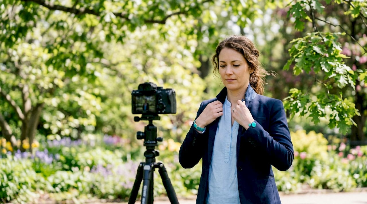
Creative professionals and real estate agents have more flexibility. An environmental background, such as a well-lit office lobby, a branded workspace, or a softly blurred outdoor setting, can communicate personality and context that a plain studio backdrop cannot. That said, the environment must be controlled. Clutter, competing colors, and busy patterns all pull attention away from your face.
- Finance and law: Navy, charcoal, or dark gray studio backdrops
- Healthcare: White, soft blue, or light gray
- Tech and startups: Light gray, modern office, or softly blurred outdoor
- Creative and real estate: Environmental or branded settings with controlled backgrounds
- General corporate: Neutral mid-tone backgrounds like warm gray or off-white work across all industries
Pro Tip: Avoid backgrounds that share the same tone as your clothing. If you wear a navy suit against a navy backdrop, you lose visual separation and your silhouette disappears.
Does the platform change which background works best?
Platform context changes everything about how a background performs. A background that looks polished at full resolution can fail completely at thumbnail size.
LinkedIn is the most demanding platform for headshots. The platform uses a circular crop and compresses images aggressively. Very dark backgrounds cause faces to blend in at thumbnail scale, reducing contrast and making the photo harder to read at a glance. Light to mid-tone neutral backgrounds, particularly light gray, give your face the contrast it needs to stand out in a crowded feed.
Light gray is the most versatile professional headshot background across all skin tones and industries. It works on LinkedIn, corporate websites, directories, and printed materials without requiring adjustments. If you are unsure which background to choose, light gray is the safest starting point.
Websites and press kits give you more room to experiment. At full resolution, an environmental background with soft depth of field reads as polished and intentional. A softly blurred office or outdoor setting can reinforce your brand story in ways a plain backdrop cannot. Backgrounds must survive aggressive resizing and circular cropping on LinkedIn, so keep your LinkedIn photo on a neutral solid and reserve environmental options for larger display formats.
- Identify your primary platform. LinkedIn requires neutral, high-contrast backgrounds. Websites allow more variety.
- Check thumbnail performance. Zoom out your photo to 60 pixels wide and confirm your face reads clearly.
- Match your LinkedIn banner. A background color that complements your banner image creates a cohesive profile at a glance.
- Avoid skin-tone matches. A background too close to your skin tone reduces separation and flattens the image.
- Test across devices. What looks sharp on a desktop monitor may look muddy on a mobile screen.
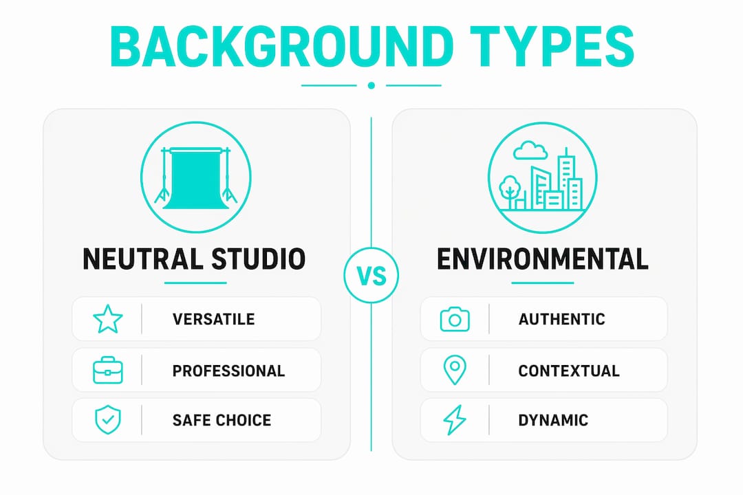
Neutral studio, environmental, and composited backgrounds compared
Each background type serves a different purpose. Knowing the tradeoffs helps you choose the right option for your specific goals.
| Background type | Best for | Aesthetic impact | Common pitfalls |
|---|---|---|---|
| Neutral studio backdrop | Finance, law, healthcare, general corporate | Clean, timeless, professional | Can feel generic if not lit well |
| Environmental setting | Real estate, creative, tech | Authentic, contextual, branded | Clutter, inconsistent lighting |
| Composited background | Multi-platform use, remote shoots | Flexible, consistent branding | Halo effects, unrealistic edges |
Neutral studio backdrops are the safest and most versatile option. They work across industries, platforms, and print formats without requiring post-processing adjustments. The tradeoff is that they can look generic if the lighting is flat or the background tone is not chosen carefully.
Environmental backgrounds add authenticity. A well-lit office lobby, a branded conference room, or a softly blurred outdoor setting tells a story that a plain backdrop cannot. The risk is that environmental settings require more control. Poor lighting, competing colors, or background clutter will undermine the photo even if your expression and pose are perfect.
Composited backgrounds offer the most flexibility. A photographer captures you against a plain backdrop, then replaces it digitally with a chosen environment. For composited backgrounds to look realistic, strong subject-to-background lighting separation is critical. Without proper edge separation, the result looks artificial and damages credibility rather than building it.
A practical approach used by experienced photographers is to capture one anchor studio portrait with controlled lighting and clean background separation. This base image becomes the source for composited versions tailored to different platforms and use cases. It reduces the need for re-shoots and keeps your branding consistent.
Pro Tip: Book at least one studio shot with a neutral background during every headshot session, even if you plan to use environmental photos as your primary image. The studio shot gives you a reliable fallback for directories, press kits, and platforms where environmental backgrounds do not display well.
How to prepare for your headshot session background selection
Preparation before your session determines whether your chosen background actually works in the final photos.
- Brief your photographer in advance. Share your industry, your primary platforms, and any brand colors your company uses. A headshot photography brief gives your photographer the context needed to recommend the right background options before you arrive.
- Plan your wardrobe around your background. Bring clothing in colors that contrast clearly with your chosen backdrop. Avoid wearing the same tone as the background. Dark clothing on a dark background and light clothing on a white background both reduce separation.
- Request rim lighting. Rim lighting and proper distance from the backdrop improve edge separation between you and the background. This matters for both in-camera results and any compositing done in post-production.
- Review test shots during the session. Ask to see a zoomed-out version of your photo on the camera screen. Confirm that your face reads clearly and that the background does not compete with your clothing or skin tone.
- Avoid busy backgrounds entirely. Patterns, textures, and cluttered environments steal focus from the face and fail at small display sizes. If you want an environmental background, choose one with a single, softly blurred focal point.
Pro Tip: Bring two or three clothing options to your session. Swapping your top against the same background gives you variety without requiring a full background change, which saves time and cost.
Key takeaways
The background you choose for a business headshot directly shapes how viewers read your professionalism, authority, and industry fit across every platform where your photo appears.
| Point | Details |
|---|---|
| Industry drives color choice | Finance and law favor navy and charcoal; healthcare and tech favor light gray and white. |
| Light gray is the safest default | It works across all skin tones, industries, and platforms including LinkedIn thumbnails. |
| Platform requirements differ | LinkedIn needs high-contrast neutral backgrounds; websites and press kits allow environmental options. |
| Anchor studio shot is essential | Capture one clean studio portrait per session as a reliable base for all composited versions. |
| Preparation prevents costly mistakes | Brief your photographer, plan wardrobe contrast, and request rim lighting before the session starts. |
What I’ve learned about backgrounds after years of headshot sessions
Most professionals treat the background as an afterthought. They show up to a session, pick whatever backdrop the studio has available, and move on. That default choice costs them more than they realize.
The background is the first thing a viewer’s eye processes before settling on the face. A background that competes with your clothing or blends with your skin tone forces the viewer’s brain to work harder. That extra effort, even if unconscious, creates a subtle negative impression. The photo feels off without the viewer knowing why.
What I’ve seen work consistently is intentionality. Professionals who arrive at a session knowing their industry signals, their primary platform, and their brand colors walk away with photos that perform better across every use case. They are not choosing a background randomly. They are making a deliberate decision that reinforces everything else their personal brand communicates.
The trend I’m watching in 2026 is a move away from the default plain gray backdrop toward backgrounds that carry more context. Softly blurred office environments, branded color washes, and carefully chosen outdoor settings are showing up more in corporate headshots. The best versions of these are indistinguishable from a well-lit studio shot at thumbnail size. The worst versions look like bad green screen work. The difference is almost always in the preparation and the lighting technique, not the post-processing.
My advice: do not let the background be the last decision you make. Make it the first.
— Justin
Professional headshots with expert background guidance at JfPhotos
JFPhotos brings over a decade of corporate headshot experience to every session in Phoenix, AZ. We consult with you before the shoot to align your background choice with your industry, your brand, and the platforms where your photo will appear.
Whether you need a clean studio portrait for LinkedIn, an environmental shot for your company website, or a full set of headshots for your entire team, JFPhotos delivers polished results with fast turnaround. Our portrait photography services include background consultation, wardrobe guidance, and professional retouching so your final image works across every context. Contact JFPhotos today to book your session and get a headshot that represents you at your best.
FAQ
What is the best background color for a business headshot?
Light gray is the most versatile background for business headshots. It works across all skin tones, industries, and platforms including LinkedIn’s circular thumbnail crop.
Should I use a dark background for my LinkedIn headshot?
Dark backgrounds are not recommended for LinkedIn. At thumbnail scale, dark backgrounds cause faces to blend in and reduce contrast, making your photo harder to read in a feed.
What background works best for finance and law professionals?
Finance and law professionals perform best with darker neutrals like navy or charcoal. These colors signal authority and trust, which are the primary qualities clients in those industries look for.
Can I use an environmental background for a corporate headshot?
Yes, but only with controlled lighting and minimal clutter. Environmental backgrounds work well for websites and press kits. For LinkedIn, stick to a neutral solid background that survives compression and circular cropping.
What is a composited background in headshot photography?
A composited background is a digitally replaced background added after the photo is taken. Strong subject-to-background lighting separation is required for a realistic result. Without it, the edges look artificial and the photo loses credibility.