

Why Coordinated Outfits Improve Family Photos
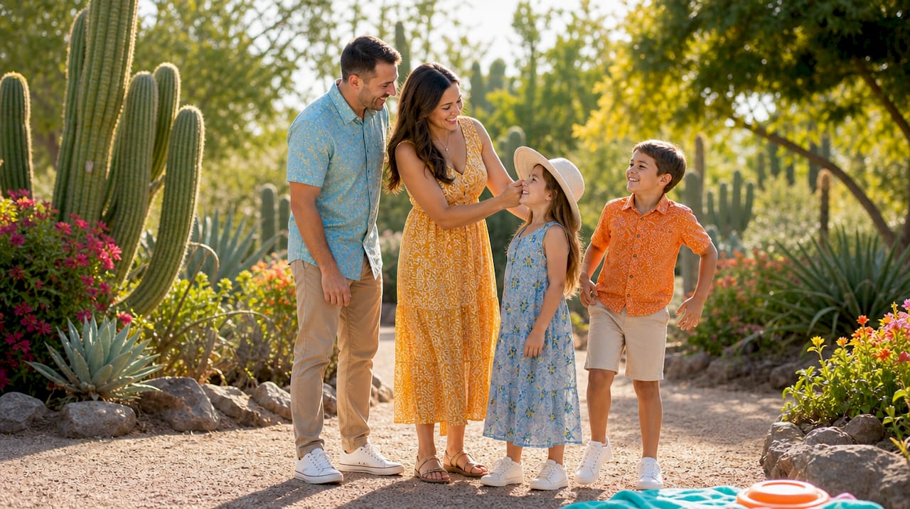
Coordinated outfits improve family photos by creating visual harmony that keeps the viewer’s eye on faces and genuine connections rather than on clothing. The result is a portrait that feels cohesive, timeless, and emotionally resonant. Here is a three-step plan you can act on right now:
- Pick an anchor. Choose one outfit you love or the person who is hardest to dress, and build everything else around it.
- Build a 3-color palette. Assign one dominant hue (60%), one secondary (30%), and one accent (10%) across the group.
- Add texture or one pattern. Use linen, denim, or a soft knit to create depth without introducing new competing colors.
Coordination does not mean everyone wears the same thing. Comfort and authenticity come first. When each person feels like themselves, expressions relax, and that is what makes a portrait worth printing.
Table of Contents
- Why coordinated outfits improve family photos more than matching does
- How to start with an anchor piece and build from there
- How to build a color palette that photographs well
- Practical guidance for each family member
- How to coordinate larger families and multi-generation shoots
- What to avoid, what to bring, and how to shop your closet
- What a decade of sessions taught us about what works
- Key Takeaways
- The detail that changes everything
- Ready to book your family portrait session with JFPhotos?
- Useful sources and further reading
Why coordinated outfits improve family photos more than matching does
Identical outfits create a uniform, not a family portrait. When every person wears the same color and cut, the eye has nowhere to travel. Coordination solves this by limiting the palette without eliminating individuality, so the composition reads as a single, unified image while each person remains distinct.
The visual mechanics work like this: a limited color palette reduces what photographers call “color competition,” where clashing hues pull the viewer’s attention away from faces. Varied silhouettes add depth to the frame. Textures create dimension that flat, matching outfits simply cannot. The result is a portrait with natural visual hierarchy, where the faces and interactions are always the focal point.
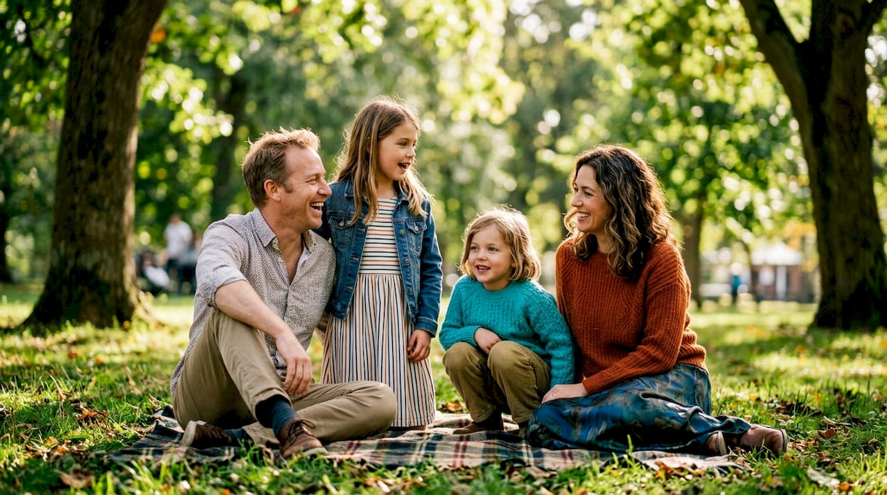
Photographers also see practical benefits during the shoot. Coordinating within a cohesive palette reduces the time spent on color correction in post-processing, because muted, harmonious tones render skin more accurately and require fewer adjustments. Families also tend to relax faster when they are not self-conscious about standing out from the group.
Pro Tip: To avoid the “uniform” look, make sure at least two family members wear different silhouettes. A flowy dress next to a structured button-down reads as coordinated, not costumed.
How to start with an anchor piece and build from there
The fastest way to make outfit decisions is to start with one anchor outfit and pull the rest of the group’s palette from it. The anchor is typically the person who is hardest to shop for, or the outfit you are most excited about featuring.
Why start there? The anchor sets three things simultaneously: the palette, the formality level, and the texture direction. Once those are locked in, every other outfit decision becomes a process of complementing rather than guessing.
Here is a practical sequence:
- Identify the anchor (often mom, a particular child, or a statement piece like a patterned dress).
- Pull two to three colors directly from that outfit.
- Assign those colors to the remaining family members, varying shades and tones rather than repeating the exact hue.
- Match formality: if the anchor is a maxi dress, avoid athletic wear on anyone else.
A few concrete examples show how this plays out. Mom wears a dusty blue maxi dress with cream embroidery: dad picks a cream linen shirt and khaki pants, kids wear dusty blue and warm white. Or: one child anchors in a rust-colored knit sweater, and the rest of the family pulls in camel, cream, and a touch of olive. The 5-step outfit formula of anchor, two neutrals, texture, and limited patterns follows this same logic and consistently produces cohesive results.
How to build a color palette that photographs well
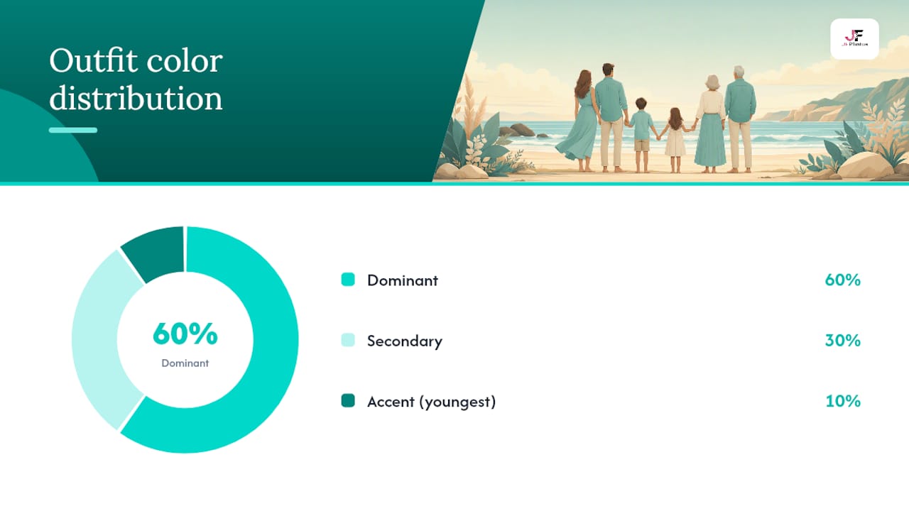
The 60-30-10 rule creates a visual hierarchy that prevents color competition and improves compositional harmony in group photos. Sixty percent of the group’s clothing falls in the dominant hue, 30% in a secondary hue, and 10% in an accent. This ratio mirrors the way designers balance interior spaces, and it translates directly to portrait photography because it gives the eye a clear path through the frame.
When choosing your palette, consider the background first. Outdoor locations with warm foliage call for earth tones; bright beach settings favor light, airy neutrals; studio sessions can support richer jewel tones. The family photography style guide at JFPhotos walks through how background and palette interact for common Arizona locations.
| Palette | Dominant (60%) | Secondary (30%) | Accent (10%) | Best for |
|---|---|---|---|---|
| Light & airy | Cream / soft white | Sage green | Blush pink | Beach, spring meadow |
| Autumn foliage | Camel / warm tan | Rust / terracotta | Deep olive | Fall parks, wooded paths |
| Jewel-toned studio | Navy blue | Burgundy | Gold | Indoor studio, dark backdrops |
| Timeless neutrals | Warm gray | Ivory | Dusty blue | Any location, holiday prints |
Distributing tones across ages and sizes matters too. Darker shades tend to recede visually, so placing a darker tone on a larger adult and lighter tones on small children balances the visual weight across the frame. The accent color works well on the youngest child or as a detail piece like a scarf or hair accessory.
Practical guidance for each family member
The goal for every person is the same: look like yourself, within the palette. What that means in practice differs by role.
Parents
Mom often anchors the session, so her outfit sets the tone. Prioritize silhouette and comfort: a dress or top she genuinely loves will show in her expression. Dad’s job is to complement without disappearing. A well-fitted button-down or casual blazer in a neutral from the palette works reliably. Avoid overly casual choices like graphic tees unless the session is intentionally relaxed.
Babies and toddlers
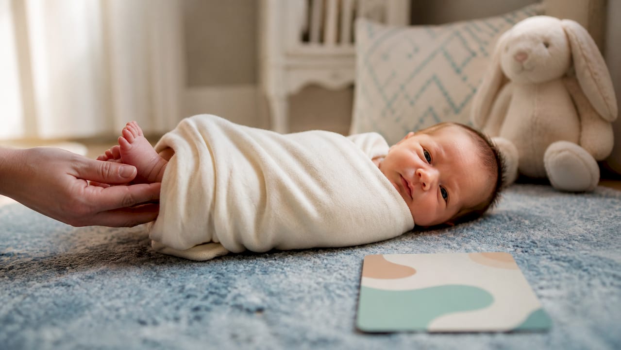
- Keep it simple: solid colors or very subtle prints in the palette’s dominant or secondary hue.
- Pack at least one backup outfit. Spit-up happens, and a quick change should not derail the session.
- Prioritize comfort above all else. A toddler in scratchy clothes will not sit still, and no amount of coordination fixes that.
- Soft footwear or bare feet photograph beautifully and keep little ones comfortable.
Teens
Teens are the trickiest family members to dress, and the worst approach is to override their preferences entirely. Give them ownership within the palette: “Pick anything in this color range that you actually like.” A teen who feels good in their outfit relaxes into the session. A teen who feels forced into something they hate will show it in every frame.
Pro Tip: Show teens the palette on your phone and let them scroll their own closet for options. When they find the piece themselves, they are invested in the outcome.
For a deeper look at how session format affects outfit choices, the types of family portrait sessions guide at JFPhotos covers studio versus outdoor and lifestyle formats in detail.
How to coordinate larger families and multi-generation shoots
For larger groups, the goal shifts from “everyone looks great individually” to “the group reads as one cohesive unit.” Simplify the palette and distribute visual weight intentionally rather than trying to clothe everyone identically.
Visual weight is determined by pattern, darkness, and structure. A dark, structured blazer carries more visual weight than a light, flowy blouse. In a large group, placing heavier visual elements at the edges or center of the frame prevents any one person from dominating the composition. Grandparents in classic navy or charcoal anchor the group visually, while younger children in lighter tones draw the eye inward.
For sibling groups of three or more, pick two to three colors, choose one anchor child, and echo tones and repeated details rather than dressing everyone identically. Graduated shades work well: oldest child in the deepest shade of the palette, middle child in a mid-tone, youngest in the lightest version of the same hue. A repeated detail, like the same style of white collar or matching shoes, creates cohesion without uniformity.
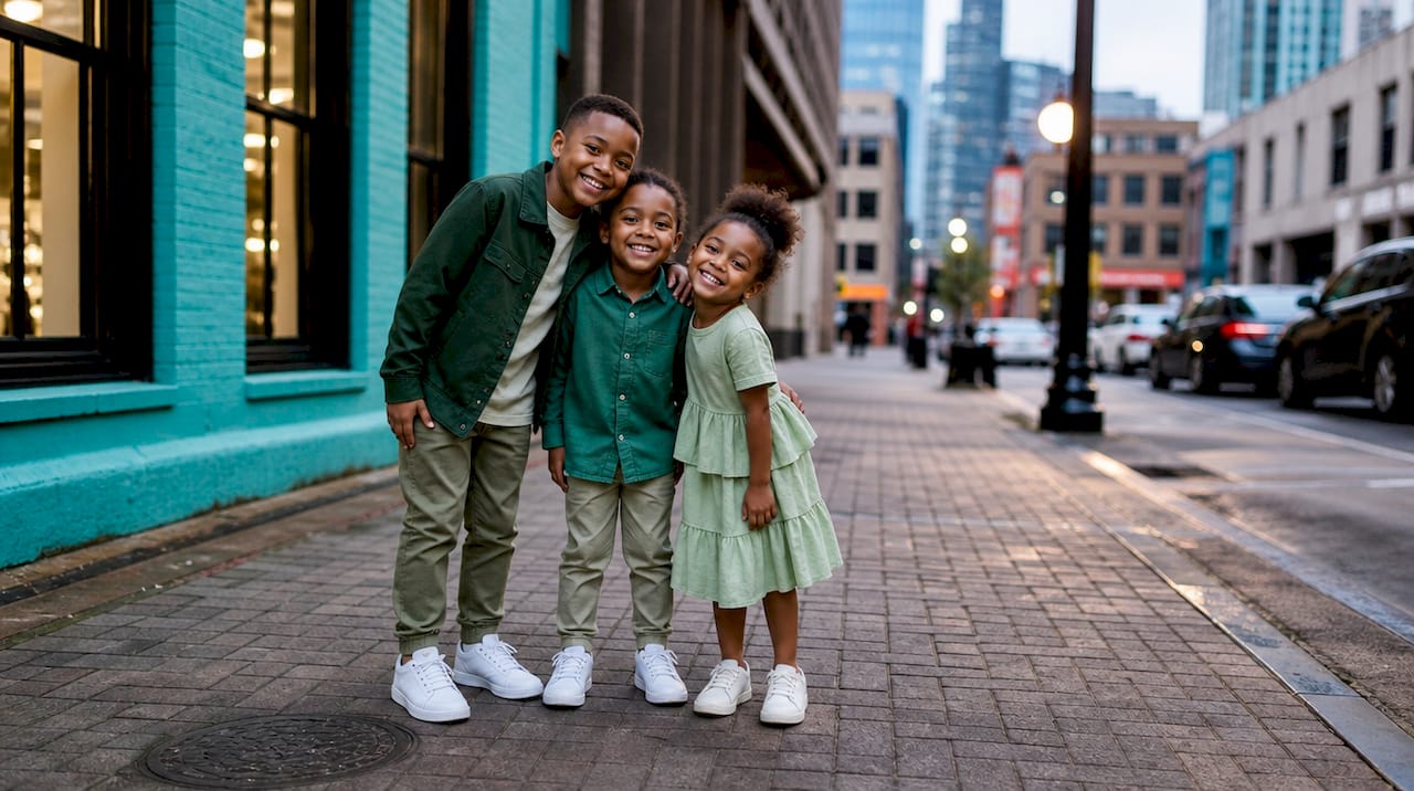
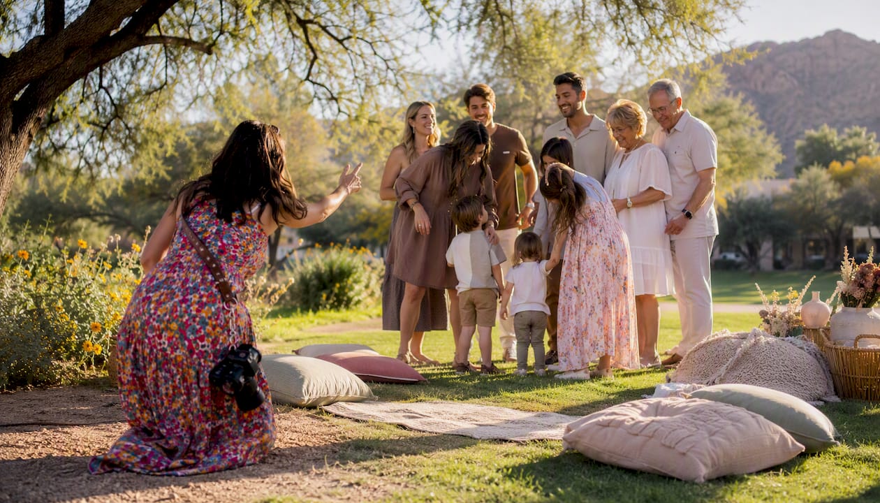
Multi-generational shoots benefit from a shared neutral base. Grandparents in cream or warm gray, parents in the secondary palette color, and children in the accent tone creates a natural visual hierarchy that reads beautifully in wide group shots. For more logistics and styling advice specific to these sessions, the multi-generational family portraits guide at JFPhotos is a practical resource.
What to avoid, what to bring, and how to shop your closet
Prioritize fit, comfort, and uncluttered patterns. Those three things matter more than any specific color or trend.
Avoid wearing:
- Neon or very bright colors. Bright neons can cast color onto skin and complicate editing significantly.
- Large logos or branded graphics; they date the photo and compete with faces.
- Tiny, busy prints (small plaids, micro-florals); they create visual noise and can cause a moiré effect on camera.
- Pure white in bright sunlight; it blows out easily and is difficult to recover in editing.
- All-black as a group palette; it flattens depth and makes the group look heavy.
- Reflective or very shiny fabrics; they create distracting hot spots under any light.
Session-day kit to pack:
- One full backup outfit per child (two for babies).
- A lint roller and small sewing kit.
- Neutral accessories (a scarf, belt, or simple jewelry) that can adjust the look on the spot.
- Clean, simple shoes for everyone; footwear is more visible in portraits than most people expect.
- Steamer or wrinkle-release spray for anything that travels in a bag.
Shopping your closet first saves time and money. Pull every piece in your palette colors and lay them on the bed together. Take a phone photo of the group and check for clashes. A neutral scarf or belt can tie a piece into the palette that would otherwise feel off. Styling tips and additional outfit formulas, including the third-piece rule, are worth reviewing before you shop for anything new.
What a decade of sessions taught us about what works
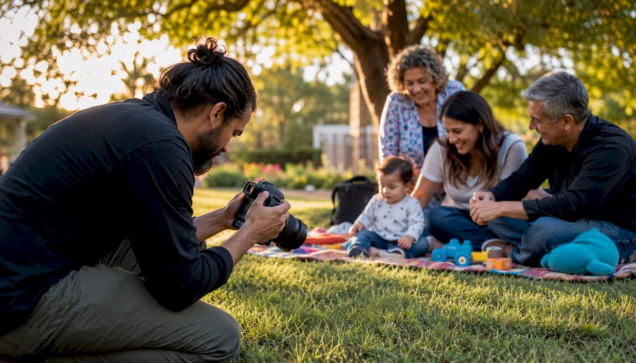
After more than ten years of photographing families in Phoenix and across Arizona, a few patterns show up consistently. The sessions that produce the strongest portraits almost always share one thing: the family coordinated without over-styling. They look like themselves, just intentionally put together.
One of the clearest before-and-after examples we see regularly: a family arrives with everyone in a slightly different shade of blue, no anchor, and two kids in busy plaid. The image looks scattered. We ask them to remove the plaid layers and swap one child into a cream top from the backup bag. The palette instantly reads as intentional, and the faces become the story again.
Coordination also speeds up the shoot itself. When the palette is clean, lighting adjustments are faster because we are not compensating for color casts from neon or reflective fabrics. Posing goes more smoothly because no one is self-conscious about standing out. The whole session runs more efficiently, which means more time for genuine moments.
Pro Tip: Bring a few extra accessories to the session: a simple scarf, a denim jacket, or a neutral cardigan. These small additions let us adjust the look on location if the light or background calls for it, without needing a full outfit change.
For more on how natural light shapes the mood of a portrait, the natural light family photography guide at JFPhotos covers how to work with Arizona’s light at different times of day.
Key Takeaways
Coordinated outfits improve family photos by reducing visual competition and keeping the focus on faces, not clothing.
| Point | Details |
|---|---|
| Coordinate, don’t match | Varied silhouettes within one palette create depth; identical outfits flatten the image. |
| Start with the anchor | Pick the hardest-to-dress person first and build the full palette from that one outfit. |
| Use the 60-30-10 rule | Assign 60% dominant, 30% secondary, and 10% accent across the group for visual hierarchy. |
| Avoid neons and busy prints | Bright colors cast onto skin and complicate editing; limit patterns to one person. |
| JFPhotos portrait sessions | JFPhotos provides in-session styling direction and palette guidance for families in Arizona. |
The detail that changes everything
Most families focus on finding the “right” outfits. After years of sessions, the bigger factor is almost always something simpler: whether the family felt comfortable and like themselves. Coordination creates the visual conditions for that comfort. When no one is worrying about standing out or clashing, the attention shifts to each other, and that is exactly what the camera captures.
The advice in this article reflects what we see work, session after session. The anchor-first approach, the 3-color palette, the texture layering: these are not abstract rules. They are the practical shortcuts that get families from “we have no idea what to wear” to portraits they will print and keep. For additional styling examples and visual references, the JFPhotos portfolio shows how these principles translate across different family sizes, locations, and seasons; see more practical styling tips in our F&Q’s.
Ready to book your family portrait session with JFPhotos?
Planning coordinated outfits is the first step. The next is working with a photographer who can guide you through the process from the first outfit question to the final delivered gallery.
JFPhotos offers professional portrait sessions in Phoenix and across Arizona, with in-session styling direction included. We help families finalize their palette before the shoot, make real-time adjustments on location, and deliver edited images with fast turnaround. You do not need to have everything figured out before you book. Bring your outfit ideas, your backup pieces, and your family. We handle the rest.
To get started, visit the JFPhotos portrait photography page and check availability for your preferred date. Sessions book quickly, especially in fall and spring, so reaching out early gives you the most flexibility.
Useful sources and further reading
The following sources informed this article and are worth bookmarking for deeper reference:
- Coordinating outfits for three or more siblings
- What is the 3 color rule in photography
- What to Wear for Family Photos: A Complete Style Guide
- Family Portrait Outfit Ideas: What to Wear
- What to Wear for Family Photos: The Foolproof 5-Step Outfit Formula for Stress-Free Family Photos
- What to Wear for Family Photos: A Simple Styling Guide — mollykatherinephotography.com
- The Washington Post
Recommended
Recent Posts