

Professional Headshot Background Options: A 2026 Guide
Light gray is considered a versatile choice for many professional headshots. It works across skin tones, industries, and platforms without creating contrast problems or thumbnail-readability issues. When you need more gravitas, charcoal or deep navy are the next-best defaults. Light gray is recognized as a broadly compatible backdrop for LinkedIn, company bios, and speaker pages.
- Go lighter (white, soft gray) when your industry signals approachability — healthcare, education, coaching — or when your wardrobe is dark and needs breathing room.
- Go darker (charcoal, deep navy) for finance, law, or executive pages where gravitas and authority matter more than warmth.
- Go environmental (office bokeh, outdoor natural light) when your role is tied to a specific setting or when a personality-forward image is needed for social or speaking materials.
LinkedIn’s circular crop sits against a white interface, so a pure-white background can make your photo disappear. Light gray or a muted tone preserves a visible edge at thumbnail scale. The smartest move is a two-shot strategy: one studio-safe neutral for your primary use, one personality-forward option for social or speaking bios.
Pro Tip: Book both shots in the same session. Wardrobe and lighting are already dialed in, and the second background adds almost no time while doubling your usable assets.
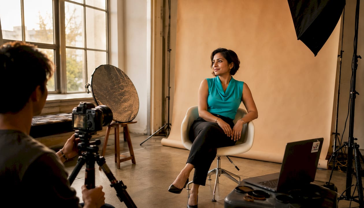
Table of Contents
- What do different professional headshot background options actually communicate?
- Which backgrounds work best for your industry?
- How do you choose the right background for your headshot?
- What technical factors actually affect your background results?
- Common background mistakes that make headshots look unprofessional
- How JFPhotos approaches background selection
- Key Takeaways
- Why test frames matter more than you think
- Ready to book your headshot session with JFPhotos?
- Useful sources
What do different professional headshot background options actually communicate?
Your background sends a signal before anyone reads your expression or your title. Color-driven first impressions are among the earliest judgments viewers make, often before they evaluate clothing or facial expression. Choosing the wrong tone can undercut an otherwise excellent portrait.
The main background categories
White. Clean, clinical, and high-contrast. Works well for healthcare professionals, product-adjacent roles, and editorial use. The risk: on LinkedIn’s white interface, a pure-white background loses its border entirely.
Light gray. The go-to default. Flatters most skin tones, reads well at thumbnail scale, and fits every industry from tech to law. No wardrobe color is likely to clash with it.
Medium gray. Slightly more dimensional than light gray. Adds depth without the formality of charcoal. A strong choice when you want a polished look without appearing severe.
Charcoal. Frames the face, adds authority, and avoids the wash-out risk of pure white on digital platforms. Dark neutrals like charcoal are trending for executive pages and printed materials because they hold up in both web and print contexts.
Deep navy. Communicates trust and stability. Popular in finance and legal sectors. Pairs well with lighter wardrobe tones and works cleanly on both dark and light website themes.
Black. High drama, high contrast. Best for actors, creative directors, and editorial use. Can feel cold or severe in corporate contexts.
Warm neutrals (cream, taupe, warm beige). Approachable and soft. Common in coaching, wellness, and personal branding. Avoid if your wardrobe is a similar warm tone — the contrast disappears.
Textured or gradient. Adds visual interest without being distracting. Gradients (dark to light) create natural depth. Textured concrete or linen works for architects, designers, and creative professionals.
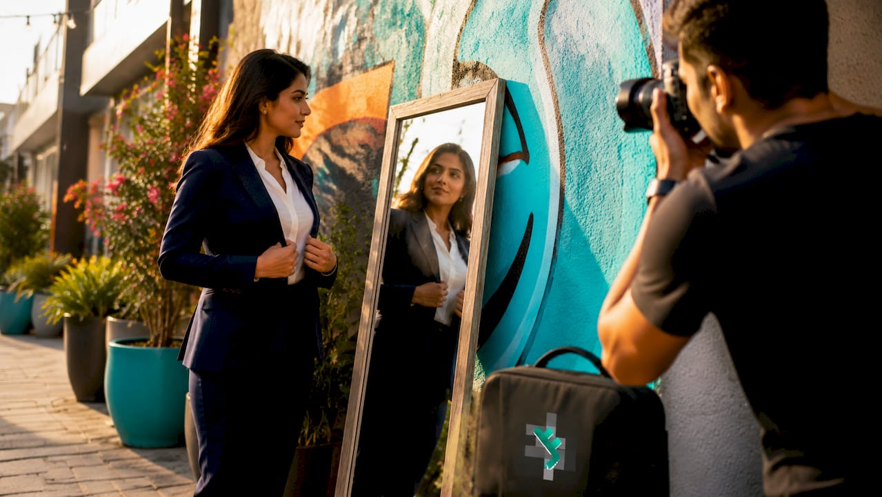
Environmental or office bokeh. Relevant when your role is tied to a specific setting. A real estate agent with a city skyline behind them or a tech founder with a modern open-office blur both work well. Environmental backgrounds succeed when they reinforce the subject’s role; otherwise they compete with the face.
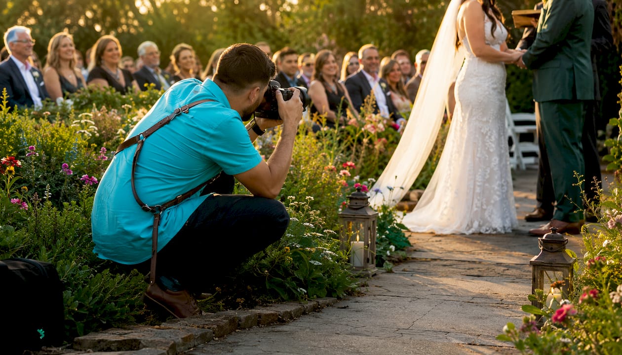
Outdoor or natural light. Warm, authentic, and approachable. Suits personal brands, coaches, and real estate professionals. Harder to standardize for team shoots.
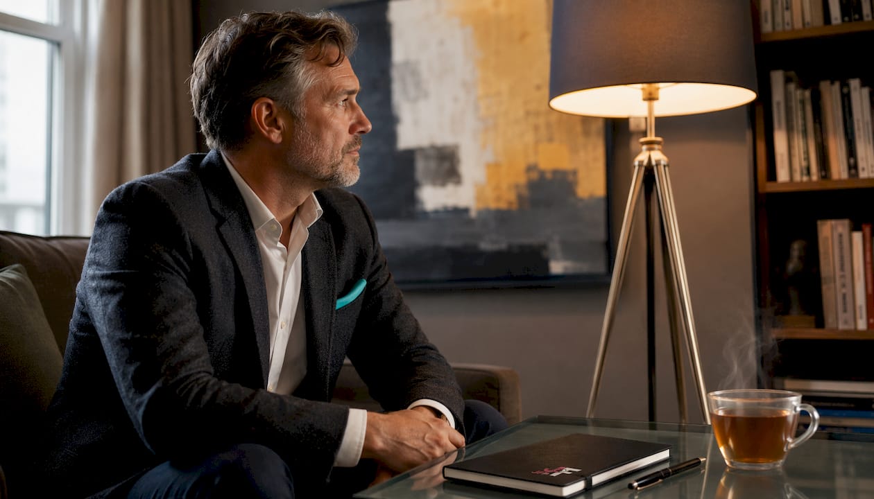
No background / seamless paper. The classic studio look. Gives maximum control over color and lighting. Easiest to retouch and reuse across platforms.
| Background | Formality | LinkedIn thumbnail | Versatility | Risk level |
|---|---|---|---|---|
| White | High | Low (border loss) | Medium | Medium |
| Light gray | Medium | High | High | Low |
| Charcoal | High | High | High | Low |
| Deep navy | High | High | Medium | Low |
| Warm neutral | Low–Medium | Medium | Medium | Medium |
| Textured/gradient | Medium | Medium | Medium | Medium |
| Environmental | Low–Medium | Low | Low | High |
| Outdoor/natural | Low | Medium | Low | High |
| Black | High | Medium | Low | Medium |
Pro Tip: Wear a color that contrasts clearly with your chosen background. A navy blazer against a navy background collapses into a single dark mass. Swap to light gray behind navy clothing, or charcoal behind a white or cream top.
Which backgrounds work best for your industry?
Industry norms shape what stakeholders expect before they even read your name. Finance and legal sectors favor dark neutrals; healthcare favors clean whites or soft blues; tech and creative fields accept gradients and environmental bokeh. Matching your background to your sector signals that you understand the room.
For a deeper look at which fields require professional headshots and why, the industries needing professional headshots guide breaks it down by sector.
- Finance and law: Charcoal, deep navy, or dark gray. Stakeholders expect authority and precision. Avoid warm tones or outdoor shots.
- Healthcare: Clean white, soft blue-gray, or light gray. Signals cleanliness and approachability. Avoid dark or dramatic backgrounds.
- Tech and startups: Light gray, gradient, or a clean office bokeh. Founders and product leads can push slightly more personality. Environmental works when the office is modern and uncluttered.
- Creative fields (design, advertising, film): Black, textured, gradient, or environmental. More latitude here, but the background still needs to serve the face, not compete with it.
- Real estate: Outdoor natural light or a city/neighborhood backdrop works well because the setting reinforces the agent’s market knowledge. Light gray is the safe fallback for team pages.
- Academia: Light gray or warm neutral. Approachable but polished. Environmental (bookshelf bokeh) is acceptable and signals expertise.
- Actors and performers: Black or dark gray for theatrical headshots; light gray or white for commercial work. Casting directors use these conventions to sort submissions quickly.
- Conference bios and speaker pages: Light gray or charcoal. These images are often displayed at small sizes next to other speakers, so clean separation and a neutral tone prevent visual noise.
- Applications and residency programs: Light gray or white. Background type influences initial impressions in video and image-based evaluations, and a professional, non-revealing background signals competence in high-stakes contexts.
Platform-specific notes
LinkedIn: Light gray or charcoal. The circular crop and white interface demand clear edge separation. Avoid white and busy environmental shots.
Company website / team page: Standardize to one background across all staff. Light gray is the easiest to match across different sessions and photographers.
Speaker or conference bio page: Charcoal or dark navy. These pages often use dark themes, and a dark background integrates cleanly.
Press or media photos: White or light gray. Editors need flexibility to place your image on varied layouts.
Pro Tip: When you need one image to work across LinkedIn, your company bio, and a speaker page, light gray is the only background that clears all three without adjustment.
How do you choose the right background for your headshot?
Use this checklist before you brief a photographer or book a session. Answering these questions takes five minutes and prevents expensive reshoots.
Decision checklist
- Identify your primary platform. Where will this image appear first? LinkedIn, a company page, a speaker bio, or a press kit each have different display contexts and thumbnail sizes.
- Check your industry norms. Look at the headshots of five peers or competitors in your field. What backgrounds do they use? Deviating too far signals you don’t know the room.
- Assess your wardrobe color. Lay your planned outfit next to a swatch of your background choice. You need clear contrast — light clothing against a darker background, or dark clothing against a lighter one.
- Consider your skin tone. Very light skin tones can wash out against white; very dark skin tones can lose separation against charcoal. Light gray and medium gray work for the widest range.
- Align with your brand colors. If your personal or company brand uses specific colors, a background that complements those tones creates visual consistency across your materials.
- Plan for cropping. LinkedIn’s circular crop cuts corners. Leave headroom above your head and keep the background clean at the edges.
- Decide if you need print variants. Print materials (book jackets, conference programs) often need higher resolution and may require a different crop ratio than web images.
Questions to ask your photographer
- What backgrounds do you have available, and can I see samples on someone with a similar skin tone?
- How far will I be placed from the background, and how does that affect the blur?
- What lens will you use, and what aperture range do you typically shoot at for headshots?
- Do you offer digital background replacement, and what are the limitations?
- What file formats and resolutions will I receive, and are web and print sizes included?
- What is your retouching policy, and how many rounds of revision are included?
For a full brief template, the headshot photography brief guide covers every question worth asking before a session.
Red flags in proofs
- Hair edges that blur into the background unnaturally (a sign of poor separation or aggressive digital replacement)
- A color cast on your skin from a colored background that wasn’t neutralized in post
- Flat, even lighting with no separation between you and the background (you look pasted onto it)
- Background texture that reads clearly at full size but turns into visual noise at thumbnail scale
Pro Tip: Ask your photographer to send one proof at 200 × 200 pixels before you approve the full edit. If the image reads clearly at that size, it will work everywhere.
What technical factors actually affect your background results?
The background you choose matters less than how it’s lit and how far you stand from it. A light gray backdrop shot poorly can look worse than a charcoal one shot well.
Lens and aperture
Photographers working on headshots typically use lenses in the 85–105mm range. That focal length compresses the background naturally and flatters facial proportions. A wider aperture (f/2–f/4) throws the background out of focus, creating smooth, optical blur that separates you from the backdrop without looking artificial. This is the look most professionals associate with a “real” studio headshot.
Background distance
Keeping meaningful distance between you and the background gives the photographer room to light each independently. A separate hair or rim light adds a subtle glow around your shoulders and head, preventing you from merging with a dark background. Without that separation, even a well-chosen charcoal backdrop can make you look flat.
Digital background replacement vs. real backdrops
AI and hybrid background services have improved significantly, but they carry specific risks worth knowing. Hair strands are the hardest element to isolate cleanly — fine or curly hair often blends into a replaced background in ways that look artificial at full resolution. In high-trust industries (law, finance, healthcare), that kind of artifact can undercut the credibility the image is supposed to build. For corporate headshot retouching and background work, real backdrops shot in controlled conditions remain the more reliable option.
File and delivery specs
- Web: 1,000–1,500px on the long edge as a JPEG at 72–96 dpi covers LinkedIn, company sites, and speaker bios.
- Print: 300 dpi at the intended print size. A book jacket or conference program needs a separate high-resolution export.
- Circular crop: Ask for a version with extra headroom and centered framing so LinkedIn’s crop doesn’t cut your forehead.
Pro Tip: To check whether blur is optical or app-generated, zoom to 100% on the proof and look at the edge where your hair meets the background. Optical blur from a real lens produces a gradual, smooth transition. App blur often shows a hard edge or a halo where the selection mask was applied.
Common background mistakes that make headshots look unprofessional
Most headshot problems aren’t about the background color — they’re about execution. These are the mistakes that show up most often in proofs.
- Color clash with wardrobe. A red blazer against a warm-toned background creates visual competition. The fix: choose a neutral background whenever your wardrobe is a saturated color.
- Visible clutter in environmental shots. A bookshelf with personal items, a cluttered desk, or a window with a distracting view all pull attention from your face. If you’re shooting environmental, clear the frame or use a longer lens to blur the background more aggressively.
- Flat lighting with no separation. When the background and subject are lit identically, the image looks two-dimensional. Ask your photographer about a separation or rim light.
- Overuse of app blur. Smartphone portrait mode and AI blur tools create a recognizable, slightly artificial look that experienced viewers notice. It’s acceptable for casual social posts but not for LinkedIn primaries or executive pages.
- Wrong crop for the platform. A headshot framed for a landscape banner will lose your face in a circular LinkedIn crop. Always confirm the intended crop before the session.
- Inconsistent team backgrounds. Standardizing team photos to one or two background choices preserves brand cohesion and prevents the “mixed look” problem on company pages, where every employee appears to have been photographed in a different decade.
Pro Tip: For team shoots, send every participant the same wardrobe guidance and background reference image before the session. Cohesion starts before anyone steps in front of the camera.
How JFPhotos approaches background selection
At JFPhotos, background selection is a decision made before the first frame, not after. The process starts with a brief consultation to identify your primary platform, industry, and wardrobe. From there, the session opens with test frames on two background options, typically a light gray and a charcoal or navy, so you can see both on camera before committing.
Lighting is set independently for the subject and the background. A hair light is standard for darker backdrops to maintain clean separation. Lens choice defaults to the 85–105mm range for natural compression and flattering proportions.
Final selects are delivered in web-optimized and print-ready formats, with a LinkedIn-cropped version included as standard. For team shoots, JFPhotos provides a standardization guide so every participant arrives with the same wardrobe and background reference, keeping the company page consistent even when sessions are scheduled weeks apart.
Portfolio examples from JFPhotos sessions illustrate how the same subject reads differently against light gray versus charcoal, and how environmental bokeh works for real estate and tech clients while staying clean enough for a company bio page.
Key Takeaways
Light gray is the single most reliable default background for professional headshots because it works across industries, skin tones, and platforms without creating contrast or thumbnail-readability problems.
| Point | Details |
|---|---|
| Default background choice | Light gray works across industries, skin tones, LinkedIn thumbnails, and print without adjustment. |
| Dark neutrals for authority | Charcoal and deep navy add gravitas for finance, law, and executive pages while holding up in print. |
| Industry calibration matters | Finance and law favor dark neutrals; healthcare favors white or soft blue-gray; creative fields accept gradients and environmental bokeh. |
| Two-shot strategy | Shoot one studio-safe neutral for primary use and one personality-forward option for social or speaking materials in the same session. |
| JFPhotos workflow | JFPhotos uses test frames on two backgrounds, independent subject and background lighting, and delivers web and print formats with a LinkedIn-cropped version included. |
Why test frames matter more than you think
Most professionals walk into a headshot session with a background color already decided. That’s understandable — you’ve done the research, you know your industry. But the background that looks right in theory often reads differently once it’s behind you on camera, under studio lighting, with your actual wardrobe.
The test-frame step exists precisely for this reason. Seeing two options side by side on a monitor, with your face in the frame, takes about five minutes and removes almost all of the uncertainty. Clients who skip it are the ones most likely to request reshoots.
The second background, the personality-forward one, tends to get more use than clients expect. It ends up on speaker bios, personal websites, and social profiles where a slightly warmer or more dynamic image fits better than the polished studio shot. Producing both in one session is the most efficient way to cover every platform without a second booking.
Ready to book your headshot session with JFPhotos?
JFPhotos offers professional headshot sessions in Phoenix, AZ, with background selection built into the process from the start — see more about Best kaitphotography.com.au Alternatives for US Weddings to compare creative service options. Every session includes a pre-shoot consultation, test frames on multiple backgrounds, independent subject and background lighting, and delivery in both web and print formats with a LinkedIn-ready crop.
Whether you need a single polished portrait or a standardized set of team headshots, JFPhotos handles the background decision, the lighting, and the retouching so you walk away with images that work across every platform you need. With over a decade of experience in portrait and commercial photography, the team knows how to match background, light, and lens to your industry and your goals.
Book your session through the portrait photography page or browse the full portfolio at JFPhotos to see how different backgrounds perform across industries before you decide.
Useful sources
- Professional Headshot Backgrounds: Colors, Types, and What Works in 2026 — Photography Shark Studios — Studio guidance on light gray as the default and dark neutrals as the trending alternative; cited for platform and thumbnail recommendations.
- Headshot Background Guide: What Works by Industry — InstaHeadshots — Industry-aligned background conventions and team standardization best practices; cited throughout the industry and common-mistakes sections.
- Best Headshot Backgrounds by Industry — Luminous Space — Guidance on when environmental backgrounds succeed or fail; cited in the background catalog.
- Does Background Type and Blurring Affect Performance Ratings in Video Interviews? — PAD Journal — Research on how background type influences initial impressions in asynchronous video interviews; cited in the applications and industry sections.
- Choosing Backgrounds for Success: The Role of Videoconference Backgrounds in Self-Presentation — Journal of Consumer Research — Four-experiment study on employee vs. customer background preferences and the competence-warmth trade-off; cited in industry recommendations.
- Virtual First Impressions: Zoom Backgrounds Affect Judgements of Trust and Competence — PLOS ONE — Research showing bookcase and plant backgrounds score highest on trustworthiness and competence; useful context for environmental background guidance.
- The Impact of Virtual Backgrounds in Video-Mediated Selection — UCF Stars — Dissertation applying Expectancy Violations Theory to virtual backgrounds in hiring contexts; supports the applications and red-flags guidance.
Recommended
Recent Posts